Friday 30 December 2011

Coursework overview

          Over the Christmas holidays I have been keeping up to date with my A3 coursework book, I have been completing my research into other films of the horror genre. I created a timeline of horror films over the last century and looked deeply into how horror movies have progressed both with theme as well as quality of the production. From some of the very earliest films like Frankenstein to some of the more modern horrors like Paranormal activity.
          I have also been concentrating on documenting all of the development work between and during making our final production in order to gather a clear understanding of what went well and not so well over the project. This has helped to increase the quality of some evaluation techniques and ideas also on how to improve our final film during our last editing session when we go back for the spring term. 
          I have also began to make notes on how our final production is going to differ from our original storyboard, which (I have discovered) will be quite drastic. This is because we made the decision during editing that all of the footage (apart from the final shot of the book) that was shot in the shed would (if included) create a very disjointed feel to the whole film opening, and over complicate the plot.
          When we get back to school we plan to fine tune all editing on the macs and complete our final product ready to show in our first lesson.

Monday 26 December 2011

Opening credits and film institution logo

          We decided on a font (using 1001 fonts as a search engine) in which to write our film institution title which would become our logo. We had to choose a font that would be both decorative enough to allow us to only use the text as the logo (as we thought this would be a very effective form of logo design), and simple enough to be easily readable. We finally decided on ghastly panic as we felt it showed the horror genre well and was otherwise very suitable for our particular film opening with its stylistic edge. Here are some screen shots made during the production of our logo:
  
Here are the two final drafts of the logo which we had to choose from (we decided on the second as we felt it had more consistency) :

          We had previously decided on a font for our opening credits (bohemian typewriter font) as we felt it tied in with our theme and was clean and precise and easily readable. here are the picture documents of our opening titles:


Thursday 22 December 2011

Research into age certificates

          I looked into some age certificate definitions to research a possible certificate or age rating for our film opening. Here are some examples of other age certificates for popular horror films.
Paranormal activity: 15
Final destination: 15
Saw: 18
Birds: 15
Dracula (1931): PG
Thirteen ghosts(2001): 15
          The majority of horror films I looked into had an age certificate of 15, some of the older ones however had a lower age rating which I think is due to the lack of new technology available at the time of production. Some of the more psychological plots seem to have a lower age rating than the physically gruesome films like saw.

          Overall I feel for the lack of vivid brutality seen in our film opening a (15) age certificate would be suitable.  

Tuesday 13 December 2011

Editing up to now

            In our first editing session we realised that our shots were actually in the wrong format for final cut express. After seeking advice from our tech support in school charlie managed to find an online converter which would convert our files into mp4 so after a few failed attempts we managed to get our files loaded and rendered onto final cut. After importing our files we began to watch them back and get them into some sort of order. We realised here just how many extra shots we actually filmed and have since deleted a few of the shots in order to make the film as a whole easier to work with. 
          Our first main task has been to cut shots and edit some to black and white (which we are using to show a flash back).
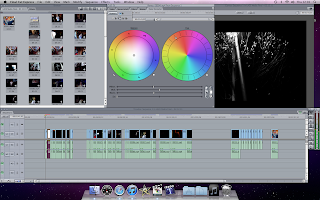
(Left) Here we went into the colour converter menu and changed the colour filter by altering the saturation to zero. This worked well and from here we also altered the brightness of some of the black and white shots in order to make them more visible (especially in the panning down shot of ellie next to the lamp post which was exceedingly dark).

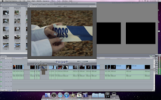
         We also really wanted to make use of the effects in final cut and create some cross fades in order to shorten the shot of the flash of the Polaroid camera and also to continue the noise of the flash after the actual on screen shot had finished playing. This effect is useful because we only wanted to use the flash as a kind of splitter between scene's (See screen shot right). We also used the cross fades to create some interesting flashes of shots in order to emphasise the disorientation and vulnerability of our victim on the cross.
        
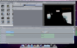
         Next we used the colour filter tool bar again to edit the lighting more in some shots to make them look better as we filmed with two different cameras and one was better quality than the other (this also helped with improving our continuity, see screen shot left).
         Today we managed to make real progress in ordering and cutting quite a few of our shots. We made the important decision of not using the shots from inside the shed as we felt that if they were included, they would have made the piece look very disjointed and hard to follow as there would be far too many different loactions to focus on.
         
         We plan to put in a few extra editing hours this week in order to make lots more progress and meet our deadline of this friday, we may stay for an hour after school today (as we did last night). The editing process is going well so far and there have been few disagreements.